Sunday, December 12, 2010

FINAL: specs and diagrams

Material Specifications

circulation diagram

space massing diagram
foot traffic diagram

FINAL: details


cad drawing of the full storage wall
perspective of storage wall


detail board

labeled detail

cad drawing of all 4 doors opened

detail of the sliding walls open

alyssa's detail of the Skyfold Classic partition wall

Diana's detail of the amphitheater

FINAL: renderings

Rendering from inside the multipurpose room looking out onto the amphitheater space.
amphitheater view 

multipurpose room with the Skyfold partition up, showing how the space as a single large multipurpose room.


Saturday, December 11, 2010

Saturday, November 20, 2010

Consensus 11/19/10

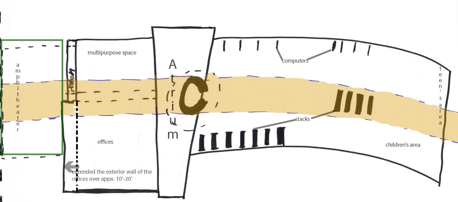
sketch showing how the circulation desk is going to connect the whole building, we haven't decided on a single unifying element right now but it will span across the whole building.


After our presentation at O'Brian-Atkins as a class we knew we needed to come to a consensus on some of our design concepts. So we decided our main design drivers were Lifelong Learning, Community, sustainability/cradle to cradle, and also designing in way that would encourage inter-generational learning.
We also need to relate the interior of the space to the exterior of the library (i.e what interior architecture is!)
We also came to a consensus that the central circulation desk should somehow be the unifying element for all the spaces.  However, there was some debate as to what the circulation desk should be, should we just have a 'book bar' instead of a fixed desk??
current cad plan we're all working off of, you can see the unifying band that runs through the building.

Friday, November 19, 2010

11-17 O'Brian/Atkins informal review: Multipurpose / Amphitheater Space

Floorplan as of 11/17/10
Above is the floor-plan as we had it designed to present to O'Brian - Atkins, with the left being multipurpose/amphitheater as well as, the offices.  The center is an atrium that connects and is a pause between the two sides of the library.  The right side is the stacks, computers, kids/teens area.
These are the 3 pdf's that my group - multipurpose/amphitheater,  presented today at O'Brian/Atkins for a pre-final informal presentation.
Materials:Furniture and Wall Options
Materials: textures and finishes

Circulation Diagram

Tuesday, November 2, 2010

Sections; building design

These are the sections the group I was apart of did for our part of the building design.  I was in a group with Lilly and Missy, we made these sections in Revitt.
Section cuts
North to South Sections
East to West Sections

Friday, October 22, 2010

Site Plan Charrette & Design


sketch I did of the front of the library, rendered in photoshop


Sketch of the back of the library, rendered in photoshop


Current Site Plan, we took our square footage from 15,000 sq. feet  to approximately between 10,000 and 12,000.  The curved right side would have a glass curtain wall and that would be where the stacks are located.  The left side is our "solid" side and it has office space, a meeting room, and some utility space.  


We hashed out a lot of ideas today during class and collectively decided to move forward with the design that Sara and Maiken's group had proposed but obviously tweaking it a little.  The main concept we took from their design was having a central circulation area with two wings that would branch off from that central atrium.  We also played with ceiling heights and areas jutting out of the building.  We want to have parking in the back as well as a green space dividing the parking and the library itself.  
A sketch I did based on the site design charrette.  

Friday, October 15, 2010

Vance Chavis Library - Building Design Charette / Advisory Meeting 10/15/10

Yesterday, we attended the Chavis library advisory meeting where members of the community and people who are connected to the library attended and we were able to present some of our ideas, as well as, get their feedback.  Here are a few of the things they communicated to us through discussion and through a hands-on exercise we did with the people who attended...
Today, we decided what our concept statement would be for designing the library.  The studio, as a whole, would have a unified concept which is,
"The re-design of the Vance Chavis site, building, and interiors will reinforce and strengthen the library's commitment to life-long learning, to community enrichment, and to environmental and social sustainability."

Tuesday, October 12, 2010

Vance Chavis Library - Site Design Charrette 10/08/10

Overlapping rectangular buildings with a courtyard within the interior of the building and have parking on west side.
Entrance on North East Corner.

square shaped plan with parking on the west side of the building.
Entrance on the North East Corner

As a class we did a design charrette during class on friday october 8th.  My group came up with three ideas for building shape and orientation on the land available to the library.  An L-shaped library, a square library, and then 2 overlapping rectangles.  My group thought the entrance would be best on the North East corner of the building because of the main roads that would trickle into Lee street from that direction and it would keep the entrance on the corner of benbow and lee street.
Current site design diagram  based on what was brought to the table during our design charette.
  As a class we decided on a more "urban" type design, specifically for the parking.  The parking would be behind the building so that the library would be right up against the sidewalk and the street.  Wanted to keep the square footage around 15,000 feet because that is the average size of the libraries that have already been remodeled in Greensboro.